We've had some complaints.
No maps or charts for far too long.
It's true, we've been remiss mostly because maps and charts involve doing work, and we haven't been all that keen on doing work lately.
So ..... ok.
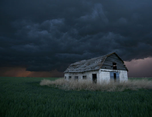
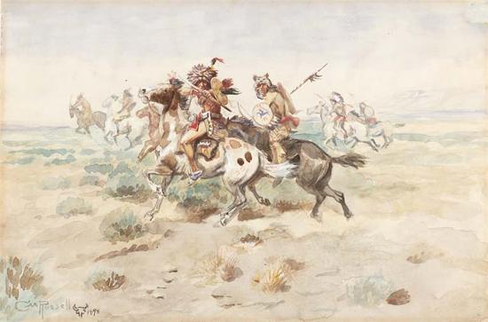
We begin with some old stuff.
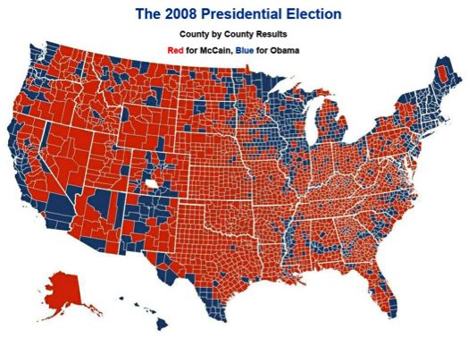
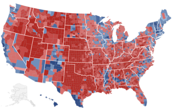
Here are county by county election results for the 2008 and 2012 presidential elections.
The "mandate" Democrats want everyone to believe they have is for the most part limited to urban communities which as you will see below, have been and continue to grow.
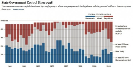
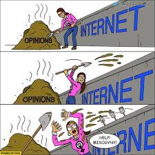
Republicans have been methodically taking control of state governments lately.
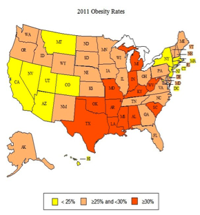
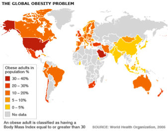
Americans continue to get fatter, but then so does everybody else who keeps tabs on such things.
"Subjective Well Being" seems to be fair to middling with the exception of Russia, large swaths of Africa and of course, Afghanistan, Somalia and Iraq where seemingly nobody gives a rat's patootie one way or the other.
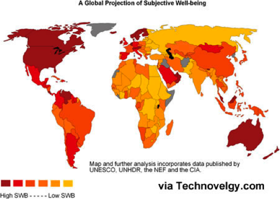
We particularly liked the part in this piece about the prominent UK politician who argued that "It’s time we admitted that there’s more to life than money, and it’s time we focused not just on GDP, but on GWB – general well-being."
Your habitually cynical Uncle Roany is of the opinion that there can be no finer goal for a politician than one that can't possible by measured.
The links to the map sources at  Technovelgy.com have broken which was a disappointment as when we first went through them we thought the criteria to be even more obtuse than we had originally guessed it might be.
Still, we thought it was an excercise worth attempting and we remain pretty sure that happier is better.
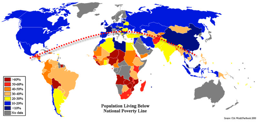
This next one from the CIA's World Factbook is also a bit tricky as it maps the percentage of a nation's population living below the poverty line of that nation. It comes with the following qualifier,
"National estimates of the percentage of the population falling below the poverty line are based on surveys of sub-groups, with the results weighted by the number of people in each group. Definitions of poverty vary considerably among nations. For example, rich nations generally employ more generous standards of poverty than poor nations."
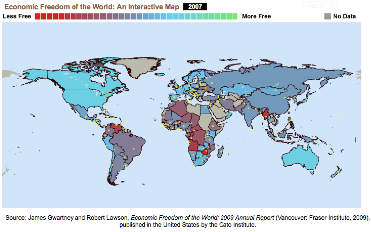
The following is The Fraser Institute's Freedom of the World 2007 map. I couldn't pull the 2012 map from the site for some reason. It's not like much has changed except for the U.S. going backwards. Click on the map below for the entire report for which the criteria is somewhat less obtuse than that behind the "Subjective Well Being" map above.
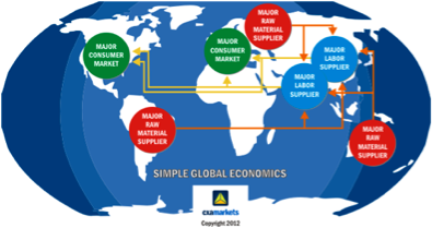
A very simple explanation of global economics is next.
Apologies for the fuzzy text.
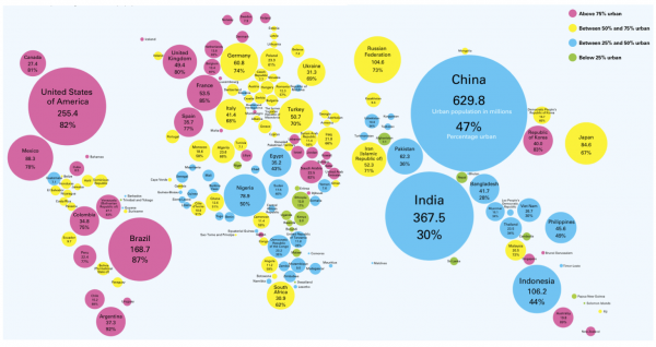
Here's a different kind of map.
Unicef's An Urban World offers percentages of each individuals country living in town.
Click on the map for a quick and informative presentation.
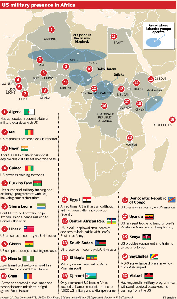
Speaking of the world, it is for the most part opposed to the Obama Administration's fondness for killing people via missile attacks launched from drone aircraft.
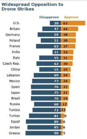
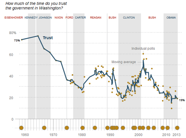
Americans are slowly coming around to a similar line of thinking.
Slowly being the operative word.


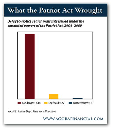
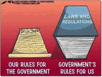
As financial costs and freedoms lost continue to add up.
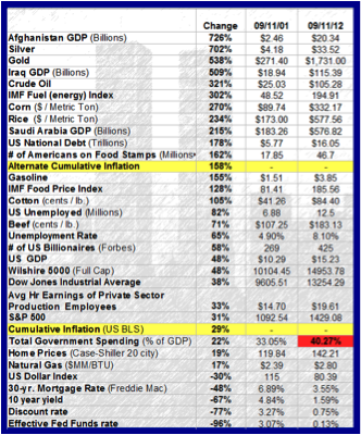
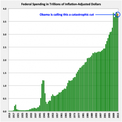
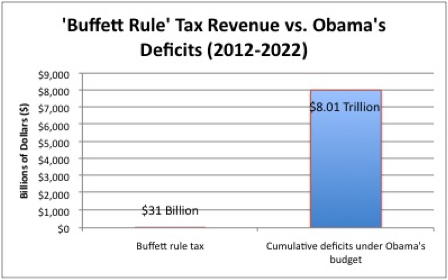
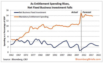
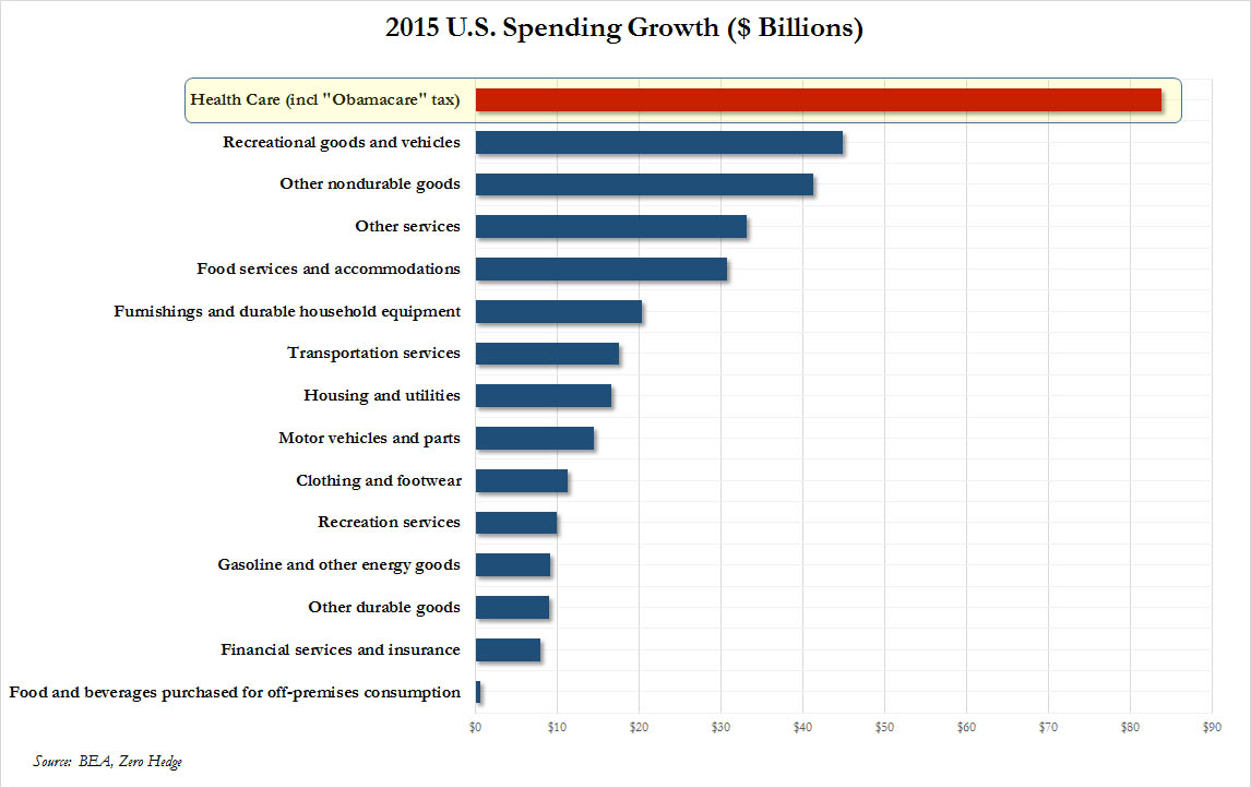
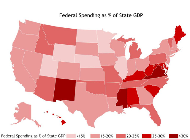
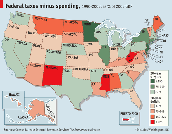
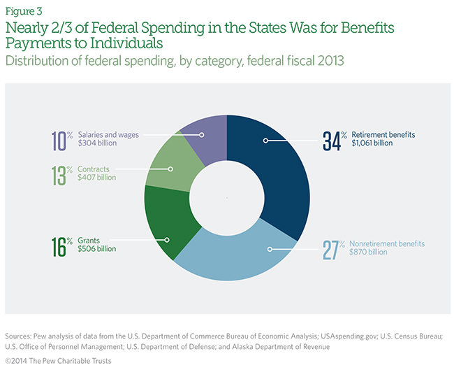
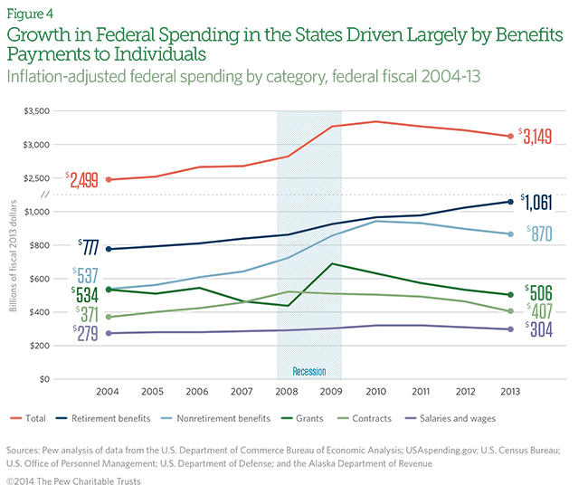
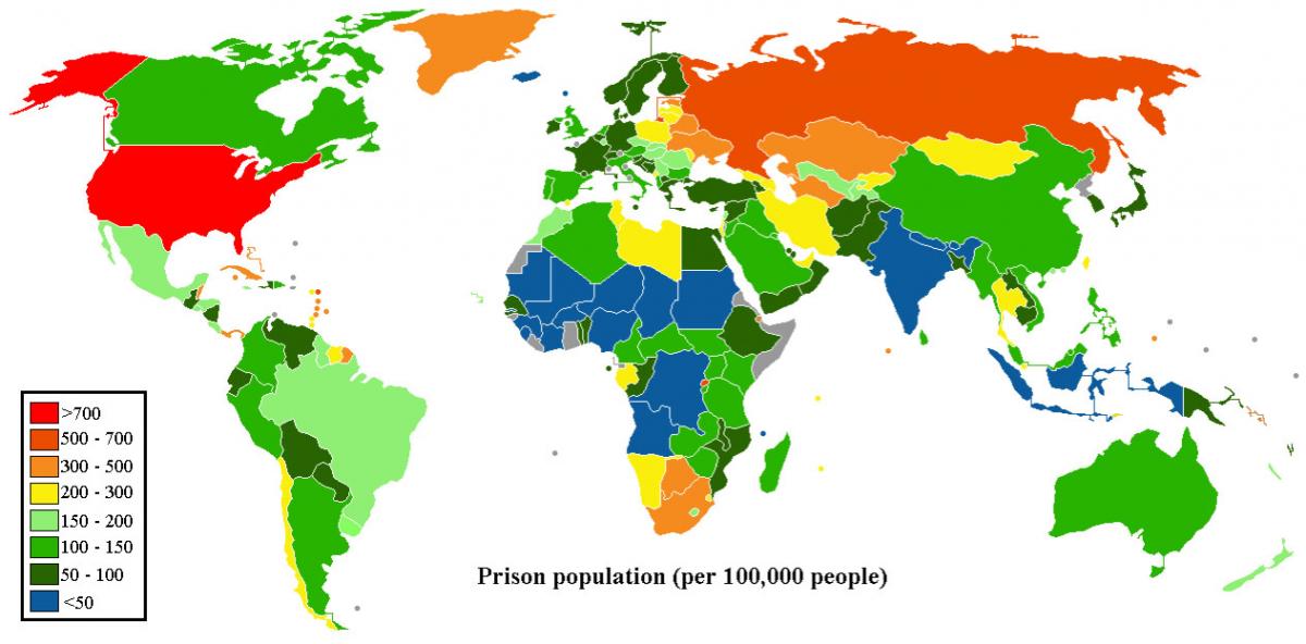
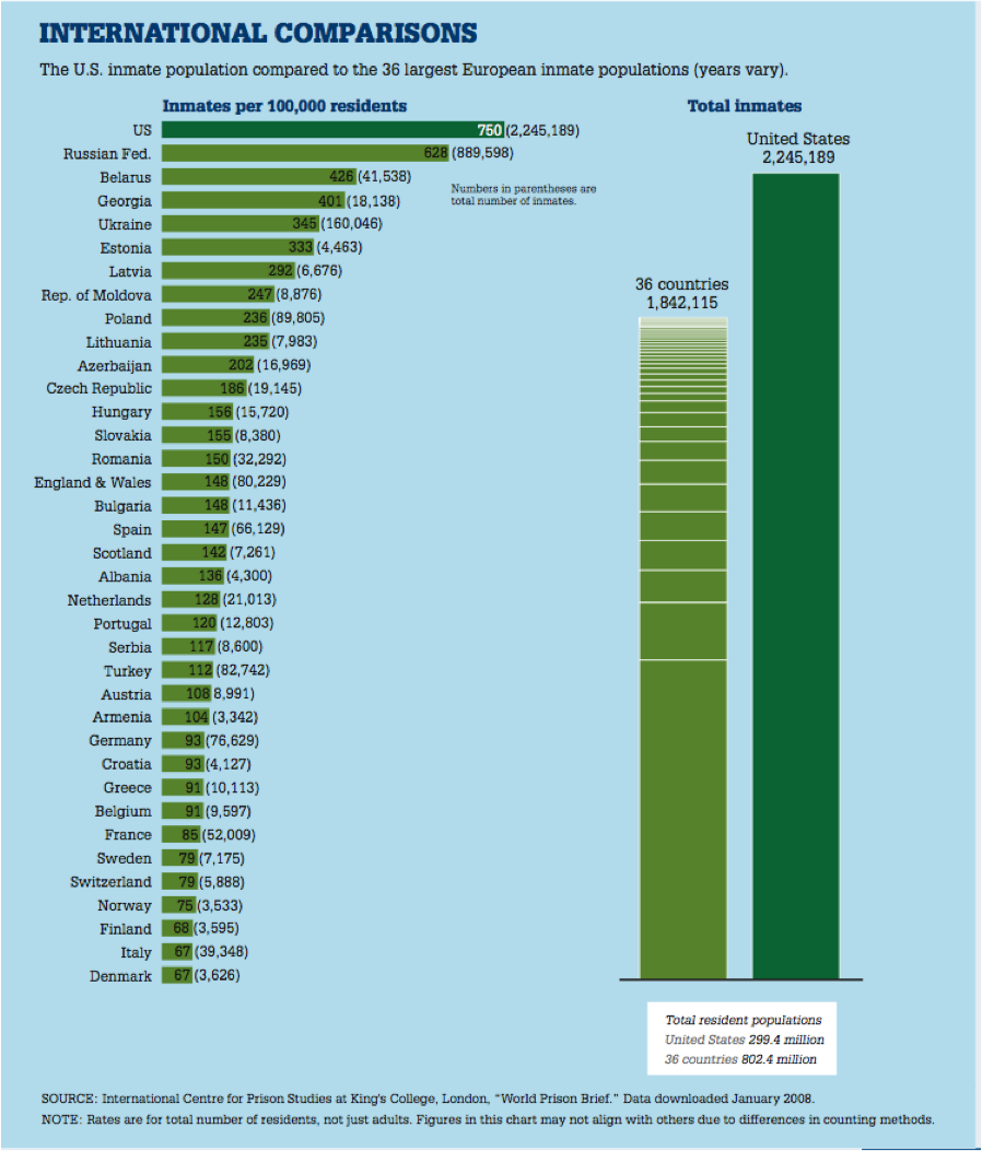
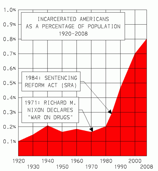
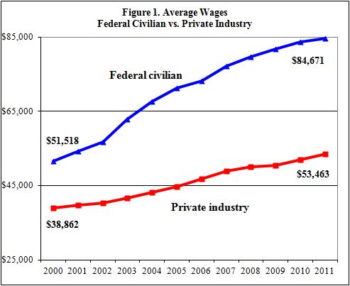
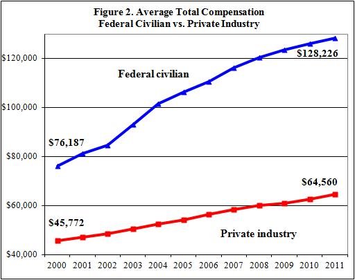
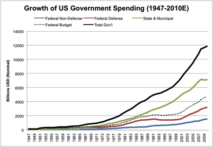
Government spending continues to climb regardless of Administration.
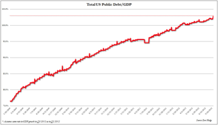
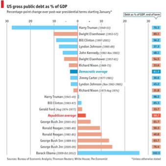
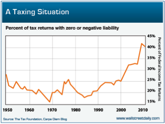
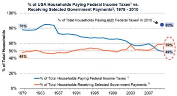
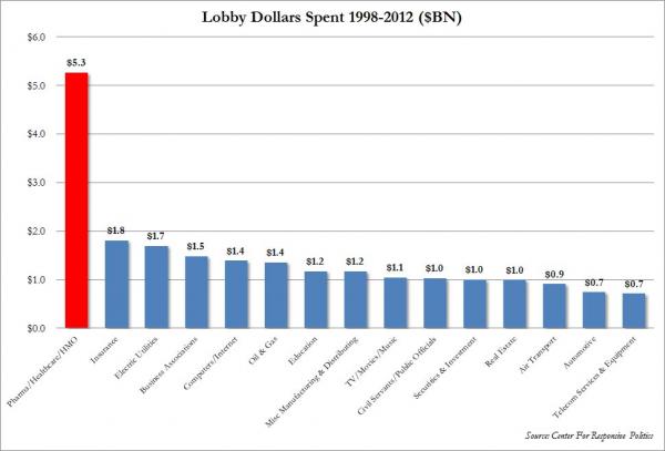
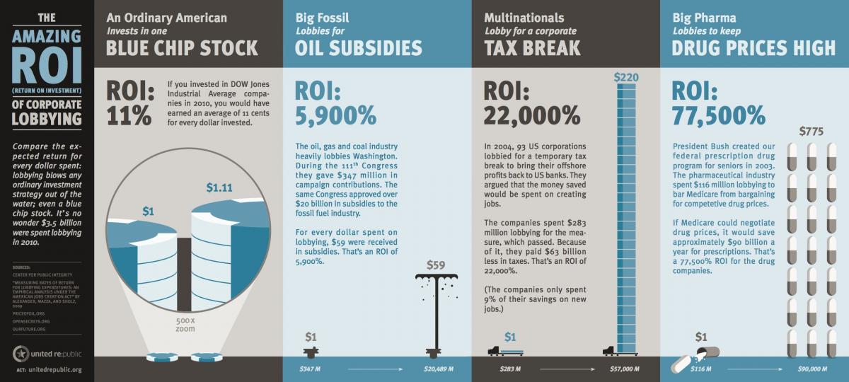
The silliness of President Obama regarding his tax and fiscal policies can be demonstrated in the following two charts.
A high percentage of Americans pay no taxes at all and over half of U.S. households are now "on the dole" for at least a part of their income.
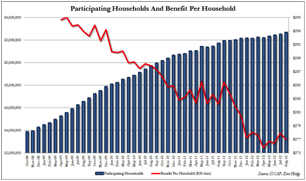
Middle class or former middle class households have been pouring onto U.S. entitlement roles adding to deficits and crowding out the poor in a scramble for benefits.
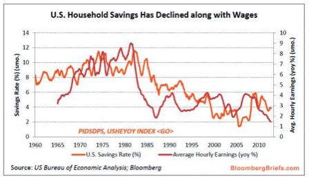
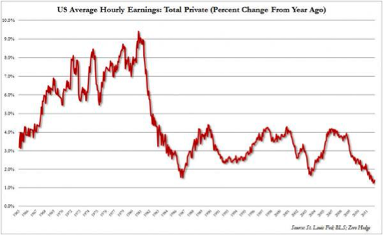
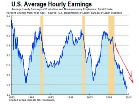
When they tell you that wages are in decline, they ain't kidding.
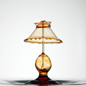
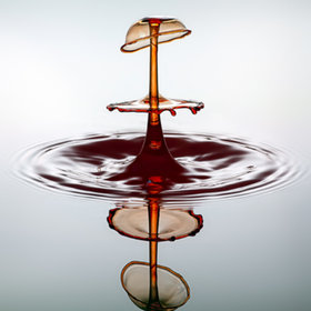
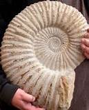
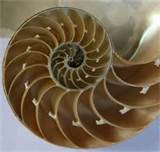
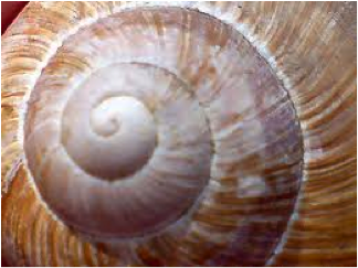
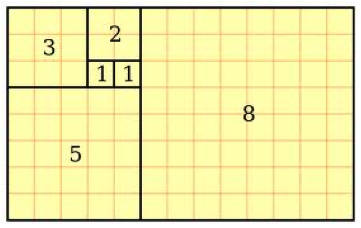
Almost finally, the Fibonacci number or ratio sometimes known as the "Golden Ratio" is forever showing up all around you.
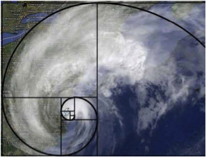
Among the better examples of it appearing in nature are shells.
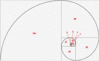
In mathematics, Fibonacci numbers, Fibonacci series or Fibonacci sequence are numbers in the following sequence.
0, 1, 1, 2, 3, 5, 8, 13, 21, 34, 55, 89 ......
Where the first two numbers in the Fibonacci sequence are 0 and 1, and each subsequent number is the sum of the previous two.
Or by formula Xn = X n -1 + X n-2.
Got that?
It doesn't matter. Here's what it looks like.
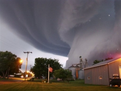
Anyway, Fbonacci showed up again just recently off the coast of New York as Hurricane Sandy.
And finally, speaking of blowing hard.
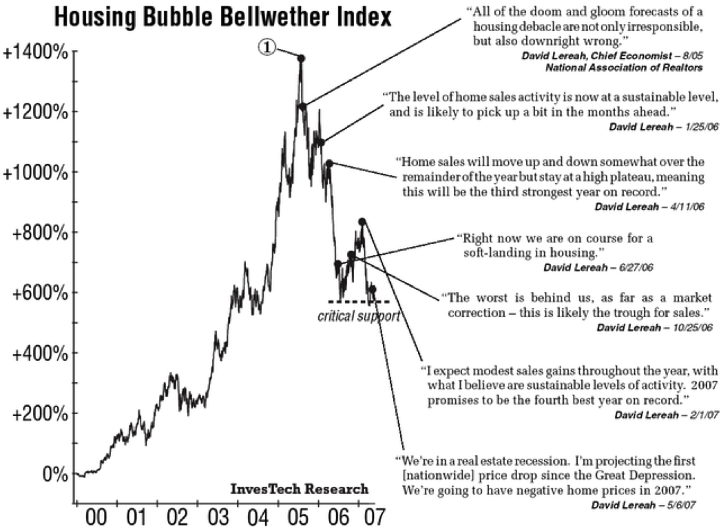
From Investech Research via Zero Hedge, here's a series of comments from National Association of Realtors spokesman and Chief Economist David Lereah plotted on a chart of housing prices.
Remember this chart the next time one of the talking dolls at CNN/MSNBC or anywhere else for that matter start talking about the housing recovery.

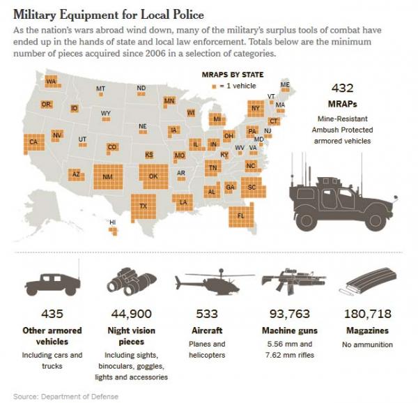
 Evidently that which was actually found was significantly different from that which was advertized to the judge asked to excecute the "No Knock" search warrant that led to the shooting deaths of Rhogena Nicholas and Dennis Tuttle in a shootout in their home with the Houston Police Department this week.
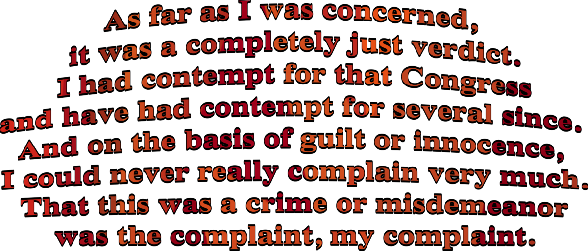


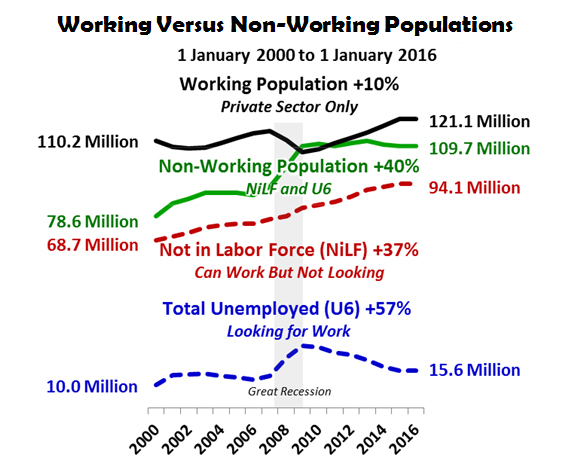
 I've been going on for sometime about what I view to be the cynically dishonest calculation for the headline unemployment number, otherwise known as U3. Which number only the most blatant of our government's paid shills in the press and the most willfully ignorant of both left and right wing partisans are able to tout without cringing.


 and
and 


![[Most Recent Quotes from www.kitco.com]](http://www.kitconet.com/charts/metals/gold/t24_au_en_usoz_2.gif)


![[Most Recent Quotes from www.kitco.com]](http://www.kitconet.com/charts/metals/silver/t24_ag_en_usoz_2.gif)