In the interest of full disclosure, I'll begin this post by stating unequivocally that I only sort of know what I'm talking about here.
And ......
Let me continue by offering the following two words to those of you who find yourselves reflexively reaching for your telephone.
Caller ID.
You will remember from previous discussions having to do with the Bradley Model, found here ,
,  here, and of course over there.
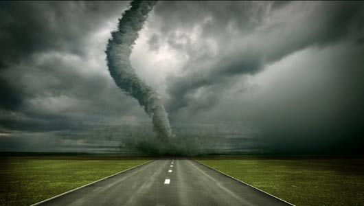
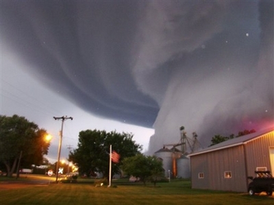
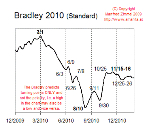
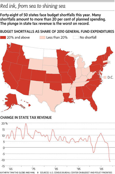
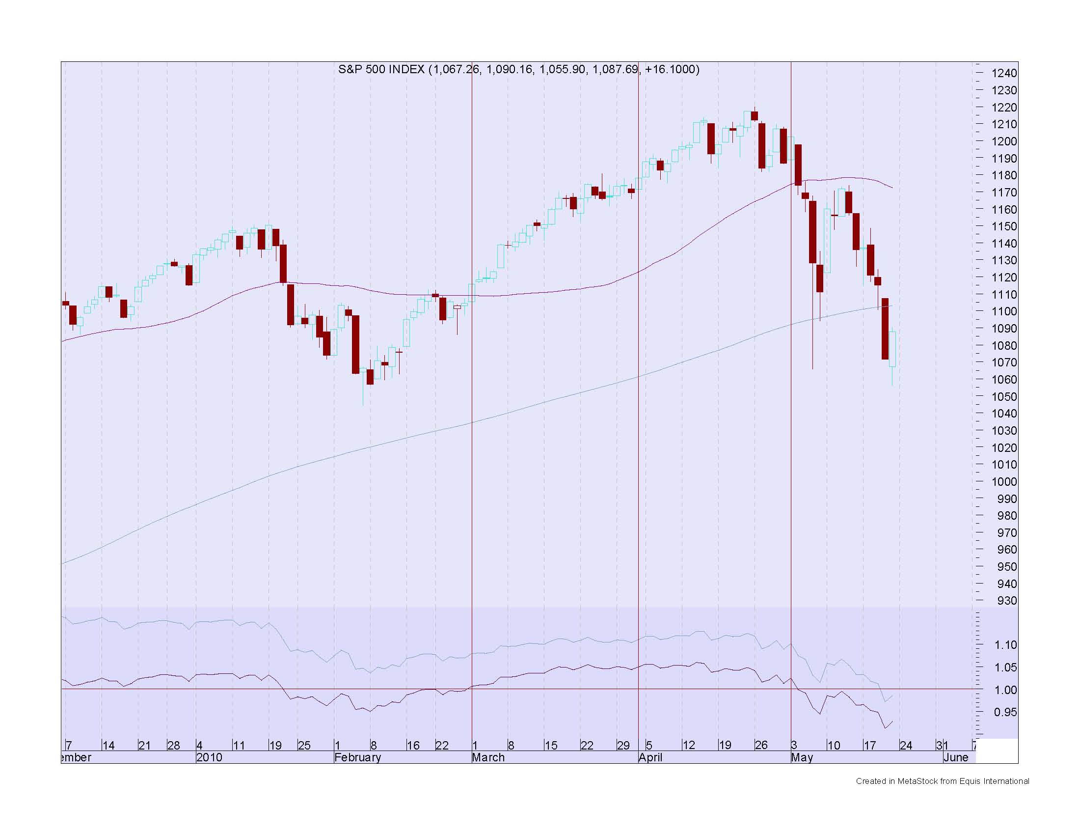
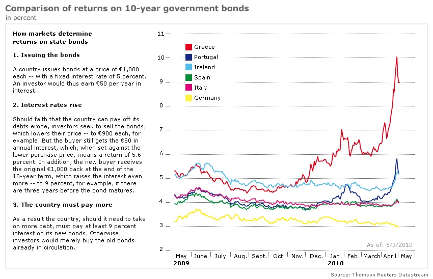
The summer of 2010 reeks of doom.
And so far, considering a monumental ecological disaster in the Gulf of Mexico, not one, but two active volcanos thinking about erupting in Iceland, an extremely impressive meltdown of the world's #2 reserve currency, the governments of the eighth and twelfth (I think) largest economies in the world (California and New York) teetering on the brink of bankcrupcy, and ..... as a sweetner  a couple of carrier groups and a nuclear armed submarine
 either heading for or already in the Persian Gulf ...
I'm giving the thing high scores for accuracy.
So ... just what exactly is the Bradley Model ... ummmm ... modeling ... viewing ... following ... I dunno ... doing.
As I explained once before.
It is simply charting the sum (positive or negative) of a set of mathematical values Mr. Bradley attached to the angles of relationship between the Sun, the Moon, and the planets within an astrological chart.
Planets in relationship of or near 0, 60, 90, 120 and 180 degrees were considered and a value (again positive or negative) was assigned each.
The positive or negative values were assigned on the basis of the historic consensus having to do with the benefic, or malefic qualities of each planet within each angular relationship between the planets.
Got it this time?
Don't worry about it. Here's all you gotta know.
Up is good, down is bad.
Here it is again.
.jpg)
Here's the Bradley Model for 2010 from Amanita.
 .
.
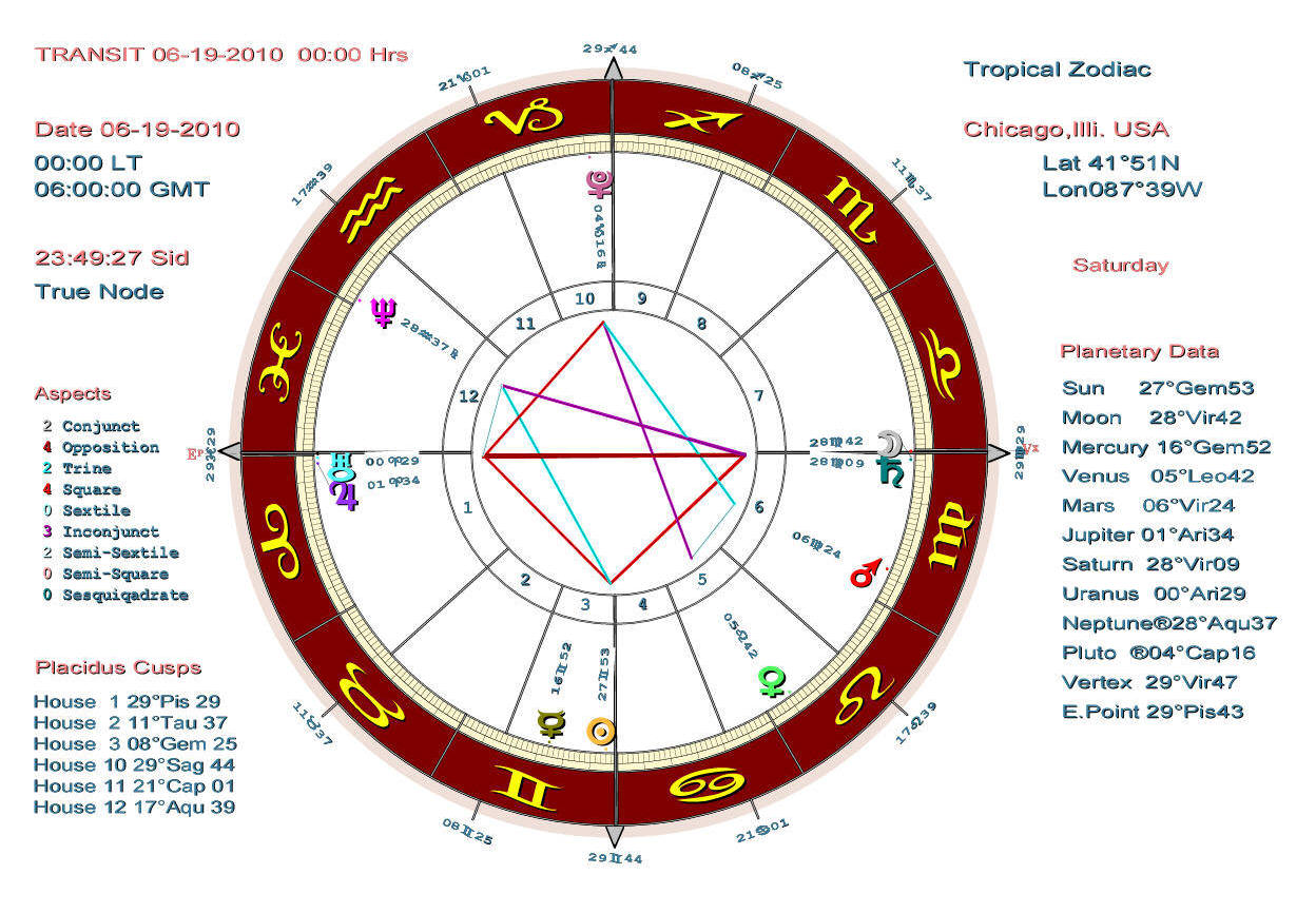
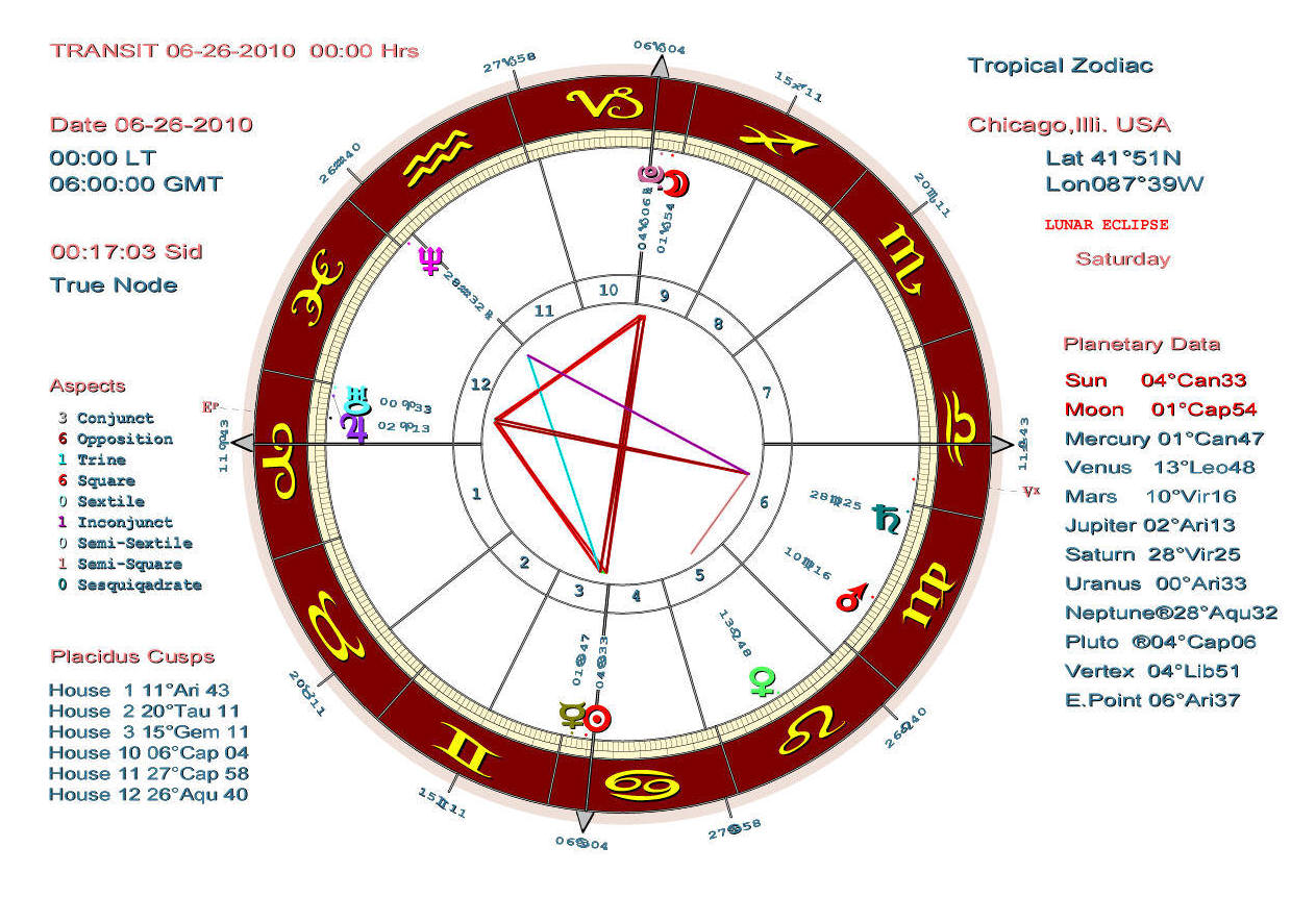
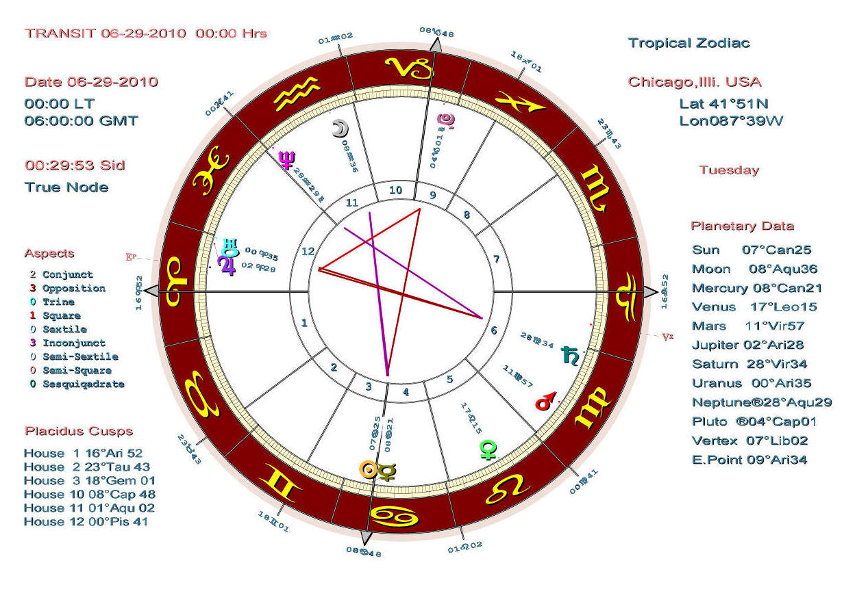
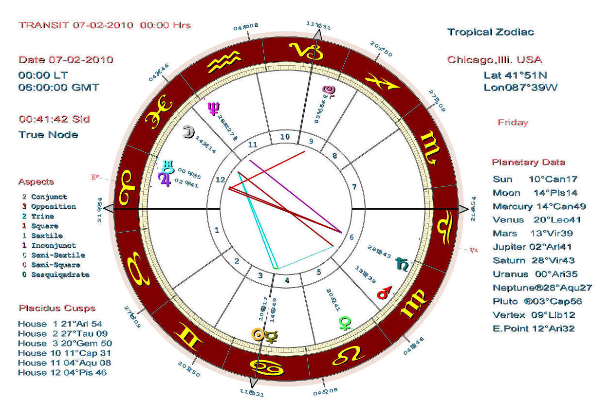
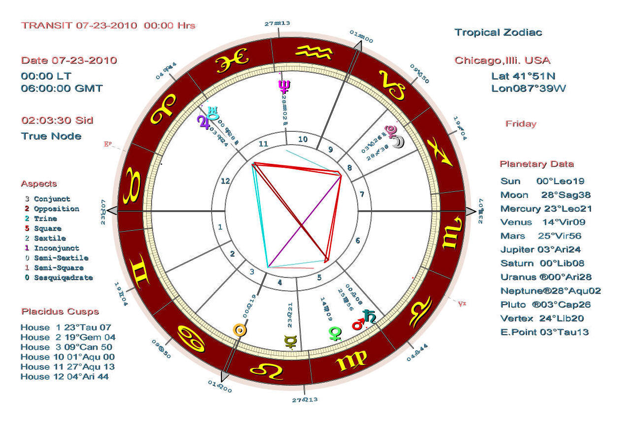
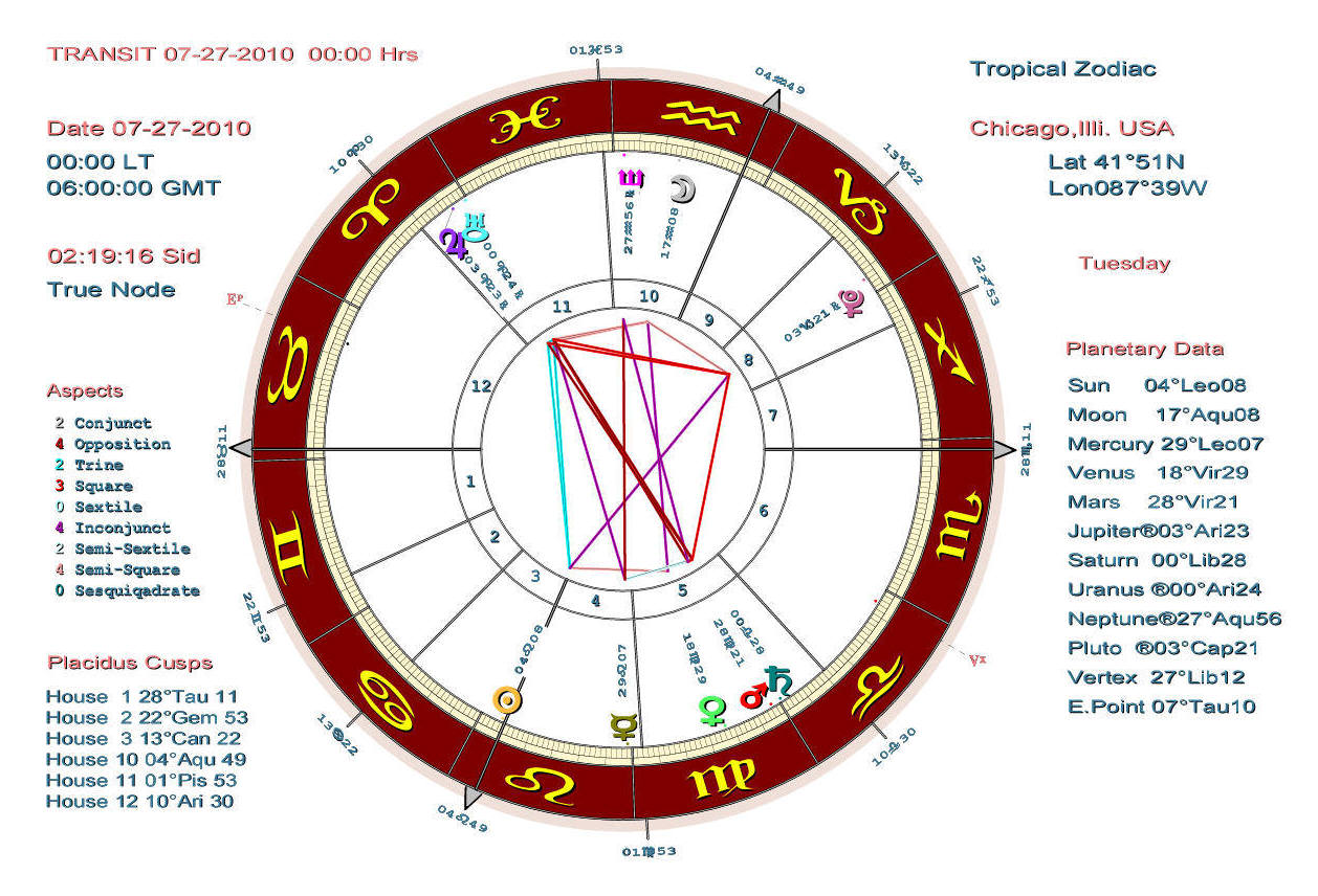
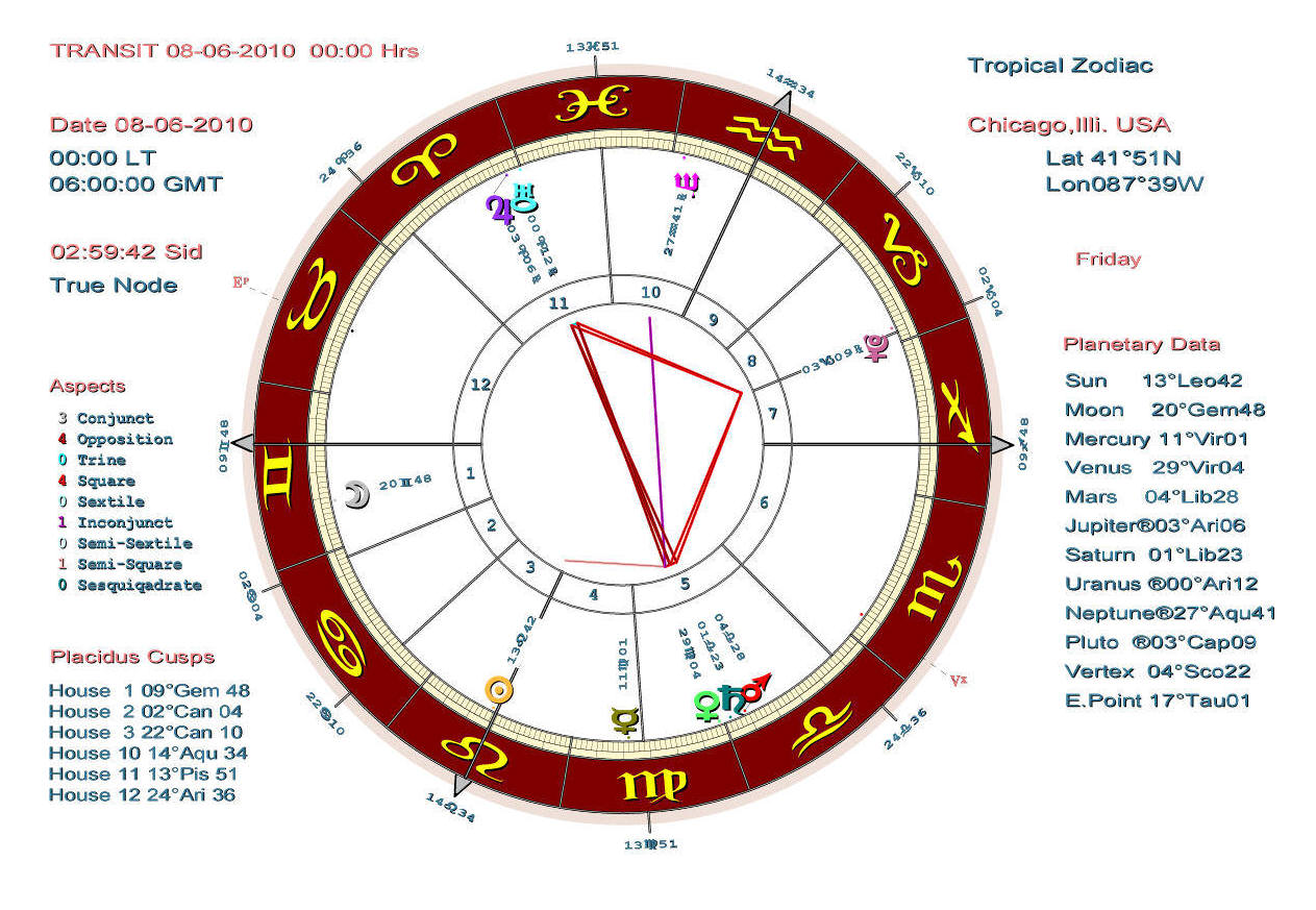
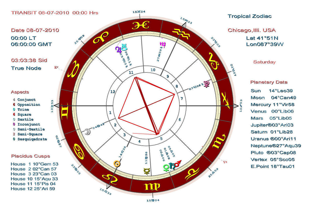
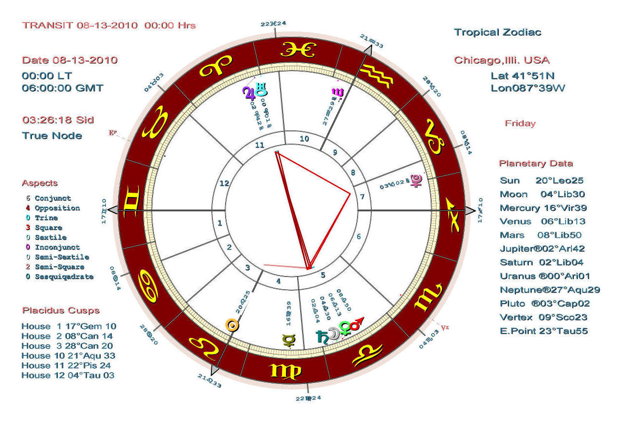
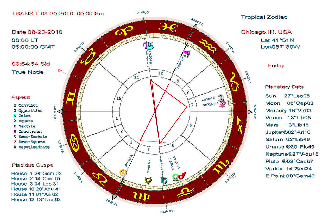
The following is the daily astrological chart taken for exactly 12 noon of June 19, 2010 at Chicago illinois,USA.
It is a chart exactly like the following from which the calculations were created/taken to create the above charts.
Got that?
Don't worry about it.
Green is good, Red is bad, Purple isn't terrible, but it ain't all that helpful either..
Why noon? Why Chicago?
Just being arbitrary.
Now .....I know exactly what you're thinking here.
Huh? ... or worse.
I understand completely and I am here to help you.
If you want to, you can safely ignore everything from here, all the way to ......
To begin with, you need to know the planets.
The purple 4 at about 9 o'clock is Jupiter.
On the positive side, Jupiter represents prosperity, growth, expansion.
On the negative side, Jupiter is inflation, over eating (spiritual, economic or physical) mistakes from overconfidence.
The light blue oval also wearing a crown at also at about 9 o'clock is Uranus.
Uranus is sudden, unexpected, explosive happenings, accidents.
Uranus is also genius, intuition, vision and breakthroughs.
The dark green th looking thing at 3 o'clock is Saturn.
On the positive side, Saturn is common sense, practical, steady, discipline, structure.
On the negative side, Saturn is hard lessons, limits, obstruction, it's the ass kicking you typically get when you screw up.
The pink cup holding a ball is Pluto.
Pluto is endings and new beginnings, death and birth, upheaval, transformation, destruction, power struggles, revolution, crime, secret police, spies, hidden things, mines and wells.
The purple pitchfork at about 10 o'clock is Neptune.
Neptune is inspiration, spirituality, sensitivity, idealism, self sacrifice, utopia, collective society, dreams, glamor, fantasy, illusion, delusion, deceit, fog, fumes, drugs, alcohol and addictions.
The golden dot within a circle at about 6 o'clock is the Sun.
The Sun is the individual, the authentic self, the will and the ego.
It also represents the national leader, power, authority.
The silver crescent is of course the Moon.
The Moon is the unconscious mind, that which you know without thinking.
In mundane astrology it is the people, the masses and women.
The red sign of the male is of course Mars, the god of war with all that implies.
The sign of the female is Venus, the goddess of love.
The little brown horny looking thing at about 6:30 is Mercury.
Mercury is thinking, communication, transportation.
Mercury is also writers, agents, public speakers, travelers, and tricksters.
..... here.
Planets sharing the same point of the circle tend to cooperate, or excite one another.
Planets at in opposite points of the circle conflict with each other (Red Lines).
Planets at 90 degree angles create friction between themselves (Red Lines).
Planets at 60 or 120 degree angles tend to assist one other (Green Lines).
Got all that?
At the risk of becoming redundant, don't worry about it.
Green is good, red is bad, purple isn't terrible, but it ain't all that helpful either.
We continue (all the while pushing the boundaries of Drupal).


![[Most Recent Quotes from www.kitco.com]](http://www.kitconet.com/charts/metals/gold/t24_au_en_usoz_2.gif)


![[Most Recent Quotes from www.kitco.com]](http://www.kitconet.com/charts/metals/silver/t24_ag_en_usoz_2.gif)