You are here

Sometimes a chart is all you need

International Misery Index

Submitted by Roanman on Thu, 02/10/2011 - 18:01


From Bryan Rich at Money and Markets via R.E. McMaster.

Click the chart below for the entire article.


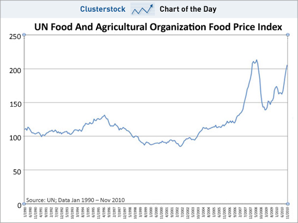
This dangerous combination of persistent unemployment and rapidly rising food inflation isn’t just specific to North Africa and the Middle East. Global unemployment remains at record levels. And world food prices rose to a record in January.

The expanding unrest is most vulnerable in those countries with low per capita income, where people may spend as much as 70 percent of their income on food. Moreover, the threat of civil disorder rises when those countries have significant income inequality and/or have gone through major economic stress where the outlook for a return to normalcy looks bleak.

In this environment, there are many countries that fit the bill. Take a look at how risks in other parts of the world stack up against Egypt and Tunisia.

The table below is a gauge of economic misery across the biggest countries in the world. This index was created by a former economic advisor to President Lyndon Johnson, Arthur Okun. It simply takes the sum of inflation and unemployment rates. According to his index, the higher the index value the more miserable life is in these countries.


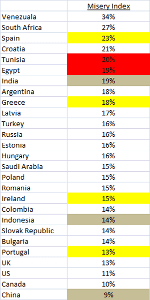
The US is at 11% only if you believe that inflation statistics shouldn't include food and fuel.


The Deficit Commission

Submitted by Roanman on Thu, 12/02/2010 - 06:08


The President's Deficit Commission released their recommendations yesterday, and they are as follows:

Taxes

Would collapse today's five income tax rates into three brackets: 8 percent for the lowest incomes, 14 percent for middle incomes and 23 percent for the wealthiest.
Would lower the corporate tax rate to 26 percent from 35 percent today.
Would end $1.1 trillion in popular tax breaks to permit these low rates. Tax breaks to be eliminated range from the deduction of mortgage interest to receiving health insurance from employers on a pre-tax basis. Such moves would broaden the tax base and make virtually all Americans pay more in taxes.
Would tax capital gains and dividends as ordinary income rather than at today's 15 percent rate.
Would raise payroll taxes on the wealthy so that 90 percent of taxable wages would be subject to the payroll tax by 2050.
Would increase the federal gas tax by 15 cents a gallon to pay for transportation improvements.


Retirement benefits

Would raise the age Americans can get Social Security benefits from 62 to 68 by 2050 and to 69 by 2075. This reflects that Americans are living and working longer.
Would allow early retirement benefits for career manual laborers.
Would boost benefits for Americans aged 81 to 85.


Spending

Would cap spending on almost all government programs through 2020 except for Social Security, Medicare, Medicaid and some defense programs.
Would require the president to propose annual limits on war spending, a major change when America is fighting two wars without a tax increase to pay for them. That has never happened in U.S. history.
 
 
Federal pay, work force

Would impose a three-year freeze on congressional pay, which now increases annually.
Would freeze pay for civilian federal workers.
Would gradually reduce the government's civilian work force by 10 percent.
 
 
Got a problem with any of that?
Let's see what you can do.
Here's another chance to balance the budget with The New York Times budget puzzle.
Click on the chart below to play.


Cut the Deficit

Submitted by Roanman on Mon, 11/22/2010 - 06:14


The much maligned New York Times has come up with some wonderful and instructive interactives over the past several months, this one stands among the best.

You are in charge.

Enact your plan to cut the deficit, the interactive does the math for you.

Click the image below to link up the site.

Recommended.


The True Size of Africa

Submitted by Roanman on Sat, 11/20/2010 - 09:13


From Good.is.

Thanks to Charley D. for this one.


 You Have No Idea How Big Africa Really Is (But This Map Does)

It's about 11.7 million square miles, which is really big—big enough to fit the United States, China, India, Japan, and much of Europe within its borders. And that's precisely what Kai Krause did with this inventive map, "The True Size of Africa," which he describes as his contribution to "the fight against rampant Immappacy."


Click on the above map for the entire piece.


Richard Russell makes it simple

Submitted by Roanman on Sat, 10/30/2010 - 09:05


More than once now, I've plugged Richard Russell and his fine site Dow Theory Letters.

As though he needs it.

The following perfectly simple explanation of how to read a chart, perfectly illustrates his value.


Question -- Are charts really of any use?

Answer -- You might as well ask the question, "Are maps of any use?" And the answer is "Yes, both charts and maps are useful with one caveat, you must know how to read them."

Let's take a current example. Below I show a daily chart of the Dow going back three months. The first thing I see is that long blue ascending trendline. It continues higher until it hits what I call a consolidation box. The box is defined by a horizontal line at its top and another one at its bottom. So far, the Dow is "caught" in the middle of the box; it hasn't broken out to the upside or the downside. 

Then I see the red arrow at RSI. The arrow points to RSI heading down. Next I see another red arrow at MACD at the bottom of the chart. Here we see MACD rolling subtly over. In both cases, RSI and MACD appear to be ready to sink lower. This suggests that the Dow will break out below the box.


 If the Dow does break below the box, where is it likely to stop? The first support appears to come in at around 10800 on the chart. That is where the last decline halted when it touched the rising trendline. Often, moving averages will provide mysterious support and resistance levels during advances and declines. Today, the 50-day moving average for the Dow comes in at 10671. This should represent a resistance level on the downside. Below that we have the 200-day MA, which comes in at 10523. 

And that's the valuable information this single daily chart of the Dow provides us with. So are charts useful? Do they serve any real purpose? I'm convinced that they do. But like an explorer with a map, you have to know how to use charts.


Piece of cake.


Pages

Subscribe to RSS - Sometimes a chart is all you need