Sometimes some charts, a couple of cartoons and a photo or two are all you need.
We have got the stuff today as we've been collecting without a post for probably the better part of three weeks now.
So, in no particular order of importance,
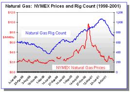
Recent Natural Gas pricing offers a primer on the law of supply and demand as supply of Nat Gas drilling rigs rises and falls with the price of Nat Gas.
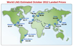
Prices for Liquid Natural Gas swing wildly from continent to continent as intercontinental transport of Natural Gas remains difficult, expensive and likely dangerous.
Some people took a less serious approach to the Presidential debates than did others.


While President Obama's epic poor performance in the first debate may not cost him the Presidency it most certainly has destroyed what little confidence the country had left in the abilities of the Telestrator in Chief.

When The New Yorker is taking cover shots at a sitting Democrat President, you gotta think all credibility is lost.

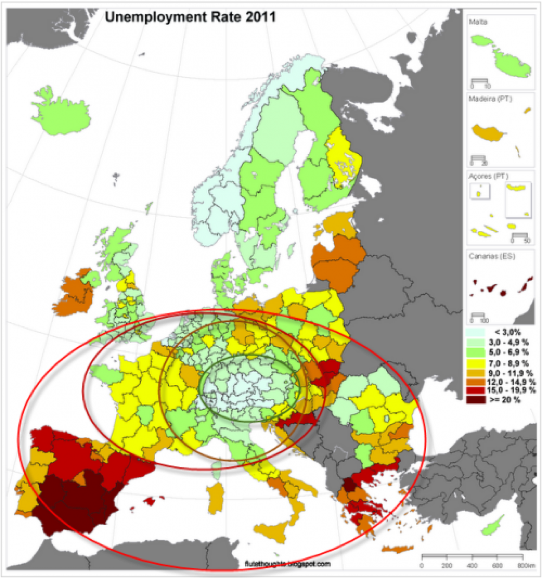
Spain has moved past debate as it's rate of unemplyment moves into the mid 20s. The real dark red in the map below is Spain for those of you who are geographically challenged.
The light blue smack in the middle of Europe is Germany, who I'm thinking would really like to stay that color.

"Recortes Son Necesarios" translates as "Cuts Are Necessary" in reference to austerity measures allegedly being implemented by the Spanish governmnent.
We trust you can grasp the meaning in the artwork.

Unbelievably to us among many, the Nobel Committee awarded the Nobel Peace Prize to the European Union despite the violence captured in the photos below.
We happen to be very comfortable laying the blame for that violence directly at the feet of the European Union, among some others.



Which award following that for President Obama inspired the following special offer.

Speaking of unemployment, the Bureau of Labor Statistics reported that the unemployment rate has fallen from 8.1 % in August to 7.8% in September on the strength of some 870,000 plus new jobs 563,000 of which were part time.
This number has been widely mocked as cooked.
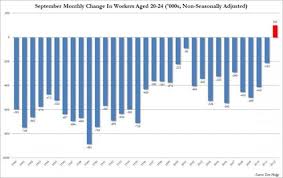
While not evidence of cooking on the part of the Labor Department, the following chart of the September Monthly Change to Workers Aged 20-24 reveals the first and only increase in employment in 28 years.
Each bar in the chart below represents a September of some year.
The fact is that September of 2012 is the first month in history that this age group has ever experienced an increase in employment during the month of September ...... you're gonna have to take our word on that last part as I can't find a chart that works.
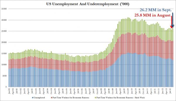
As demonstrated in this next chart, the number of unemployed and underemployed people for the month of September increased from 25.8 million in August to 26.2 million in September.
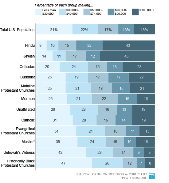
I don't know what this has to do with anything, but I thought it to be interesting and saved it to whip out the next time there is an uncomfortable lull in the conversation at some cocktail party I may be attending.
From The Pew Forum.
Finally, because I'm out of both time and energy for the moment, that's it for now.
We finish today's report with the fundamental difference between Mom and Dad.












![[Most Recent Quotes from www.kitco.com]](http://www.kitconet.com/charts/metals/gold/t24_au_en_usoz_2.gif)




![[Most Recent Quotes from www.kitco.com]](http://www.kitconet.com/charts/metals/silver/t24_ag_en_usoz_2.gif)
