You are here

Sometimes a chart is all you need

Dropout Factories, continued

Submitted by Roanman on Mon, 10/25/2010 - 12:52


The following unfunny cartoon links (didn't want you to miss it) to an outstanding Associated Press interactive titled "Dropout Factories".

The interactive breaks down the country by state, and provides both a list of, and totals for the "dropout factories" within each individual state.

It also provides a discussion of the criteria from which the lists were developed.

You absolutely need to do this one, painful though it may be.


Male vs. Female Unemployment

Submitted by Roanman on Fri, 10/22/2010 - 08:59


From one of our favorite bloggers, Professor Mark J. Perry at the University of Michigan Flint campus, at his outstanding blog,  Carpe Diem.

" ... for every 100 jobs lost by women since the start of the recession in late 2007, men have lost an astonishing 219 jobs."

Click on the chart below for the entire post.


Cooking the Books

Submitted by Roanman on Sat, 10/16/2010 - 09:41


In an effort to evade the truth, municipal governments have taken a lessons from the Federal Government and are cooking the books in order to cover up the extent of their promised but unfunded pension liabilities.

Cynical Roany will take this opportunity to point out that by and large, the very same people calling for transparent accounting at the corporate level are lying through their teeth via their own accounting practices at every single level of government ......... federal, state and local.

Click the chart below to catch the very simple three paragraph story that comes with this chart.

Or probably more important to you, this here little gear here will take you to another Clusterstock story which ranks the ten cities in the deepest doo-doo.


Two charts from Richard Russell

Submitted by Roanman on Fri, 10/15/2010 - 08:08


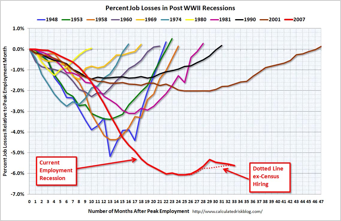
As previously disclosed, for many years, I've read people who have been reading Richard Russell for many years.

When what I should have been doing was reading Richard Russell.

Along with Harry Schultz and Joe Granville he clearly is one of the grand old men of the financial newsletter business.

Despite the fact that Mr. Russell is now 86 and significantly less hail than he used to be, I just dropped another $175 for a 6 month subscription to his newsletter, the Dow Theory Letter, despite the disclaimer at the bottom of the offering that reads something to the effect that, "You know Richard is 86 years old, Right?  Ain't gonna be no refund.

If it goes just one week, it will have been cheap at twice the price.

The chart below is for DBC, the commodity tracking index offered on the New York Stock exchange.


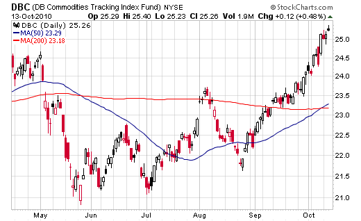
Richard pulls out some of the items that make up that index immediately below.


 Scoreboard year-to-date in percentages -- Agricultural 

Cattle (lb)....................+12.0%
Coffee (lb)...................+36.9%
Corn (bu).....................+37.3%
Cotton (lb)...................+46.7%
Lumber(1000 bd.ft.)....+32.9%
Orange Juice (lb)..........+19.7%
Soy beans (bu)..............+13.2%
Wheat (bu)....................+29.8%


 With the following commentary


"Trouble -- The poverty sector and the middle class are having trouble enough, but the chart below spells more pain. This is the Commodity chart, and it's telling us that the price of food is heading skyward. With the price of food (corn, grains) heading higher and with oil now over 83, the squeeze is on for the majority of Americans.

The US is floating in liquidity. And nobody knows what to do with it. Which is one reason why stocks have been floating higher. Should you buy farm land, housing, commodities, silver, bonds, gold, insurance, what? There's no safe return on anything."


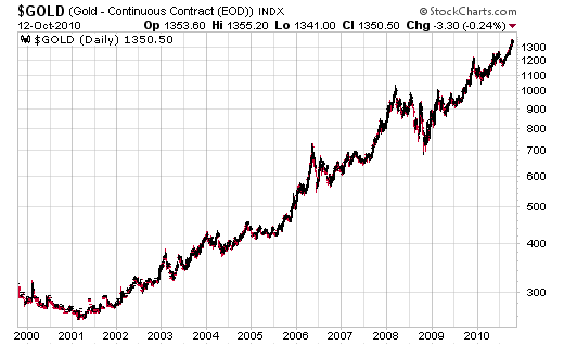
Here's Mr. Russell's latest writing on Gold.


  Around 1999 and 2000 gold was selling at just above 260 an ounce. But more important, many well-known gold shares were selling like second-hand rain coats. These formerly much-loved gold shares were selling at such low or bargain prices that I thought one could buy thousands of shares and just "put 'em away" and forget about them. I knew gold wasn't going out of style, and it was just a matter of time before interest in gold returned, as it has in all history.

Great bull markets start with stocks selling "below known values." That's where gold mining shares were selling around 1999 and 2000. I equated gold shares in the year 2000 with the Dow in June 1999 at a time when the Dow was priced at 161. In the year 2000, I thought to myself, "Could this be the very beginning of a great bull market in gold, a bull market that could ultimately take gold above its January 1980 peak price of 850? That idea stuck in my head; in fact I became obsessed with the idea that a great bull market was beginning and very few people even suspected that was happening in gold.

Question -- OK, Russell, gold is now well above its peak price of 850 struck in 1980. So what do you expect next?

Answer -- I went through this same phenomenon in the 1960s with the stock market. We went through the correction of 1953, and we staggered through the vicious correction of 1957. In 1957 a severe recession enveloped the US economy, and almost everybody was convinced that the bull market that had started in 1949 had ended.

I learned from George Schaefer that big bull markets almost always end with a speculative explosion. We had not seen that kind of action in the bull market that started in June, 1949. I was convinced that a speculative third phase of the bull market lay somewhere ahead. For that reason I was convinced that the bull market was not over.

In fact, I was so sure of my stand that I wrote an article that was published in Barron's (December, 1958) in which I made the case for a coming final boom phase in the stock market. That article drew a great amount of interest, and it put me in business. A speculative third phase did appear in the stock market during 1956 through the early '60s.

Today I am taking the same stand regarding the gold bull market. The gold bull market will not end with a fizzle and a whimper. It will end with intense speculation and widespread interest from the funds and the public. We haven't seen that kind of activity yet, but I'm convinced that a period of wild speculation in gold lies somewhere ahead.

This is why I continue to beg my subscribers to load up with gold. As I see it, we are nearing a period of intense speculation that will be beyond anything seen before by the last three generations of Americans. Ironically, more money made in the final explosion in gold than was made during the first two phases combined.

Great bull market are seen maybe once or twice in a lifetime. The current "stealth" gold bull market has sneaked up on most Americans. The very phrase, "gold bull market" is sneered at by most analysts today. In fact, most of the comments on gold today come in the form of warnings; "Gold is too high." "Gold is in a bubble." "Gold will sink back below 1000." "Gold is a fool's play."

Nonsense. Gold is moving ever-closer to it's climactic speculative third phase. The negative comments about gold will only serve to make the gold bull market that much stronger. In this business, there is nothing more powerful than a primary bull market that has been denigrated, spat at, and held back for years.

And that's the end of my "lecture" about the fabulous gold bull market.

Below, the profile of one of history's greatest primary bull markets (and it's not finished yet).


 Either chart will link you up to Richard Russell's fine site.

Super duper way double highly recommended ......... with the previously discussed caveat.


Reading on a Sunday morning, as usual

Submitted by Roanman on Sun, 10/10/2010 - 10:42


Jesse's Cafe Americain is of of my very favorite sites.

To begin with, his biases align perfectly with my own, which of course causes me to think he's really, really smart.

I also thoroughly enjoy the poster art with which he decorates this fine site.

Obviously ..... recommended.

Anyway, the chart below links to a pretty simple discussion titled "Triffin's Dilema Reserve Currencies and Gold" by Walker Todd which begins as follows:


Nearly 50 years ago, Yale University economist Robert Triffin identified the inevitable future deterioration of the dollar in his book, Gold and the Dollar Crisis: The Future of Convertibility (1960). Essentially, Triffin argued, under the Bretton Woods system in which the U.S. dollar was the world’s principal reserve currency (instead of gold, for example), the United States had to incur large trade deficits in order to provide the rest of the world with the liquidity required for functioning of the global trading system. 

Unfortunately, Triffin wrote, U.S. trade deficits eventually would undermine the foreign exchange value of the dollar because foreign accounts would hold an increasing quantity of dollars. Restating Triffin's argument in contemporary terms, as the proportion of dollar claims held abroad versus U.S. gross domestic product (GDP) increases, the foreign exchange value of the dollar must decline if dollar interest rates do not increase at about the same rate as the foreign dollar claims.


The article was originally posted at the American Institute for Economic Research.

Jesse's provided a link at the top of his post to the entire Walker Todd piece.

Got all that?

Jesse has most of it with a cool chart.

AIG has all of it without the chart.

It's all good and not too tough to get your mind around.

Next.


Reading on a Sunday morning continues, as usual.

Submitted by Roanman on Sun, 10/10/2010 - 09:46


Here are two clear, simple and depressing charts from Calculated Risk.

I'm starting to really like this site, having been turned on to it by Clusterstock Chart of the Day.

It's a little random which we really like around here, with concise, easy to understand posts.

Recommended.

Click either chart for the entire post.


Vote Easy

Submitted by Roanman on Wed, 10/06/2010 - 14:36


From Project Vote Smart, here's just the best interactive you're ever going to see.

You're asked your opinion on twelve issues, and then you are asked to evaluate how important each issue is to your ultimate voting decision.

Vote Easy then gets busy and provides you with an interactive chart of the candidates in you state and a percentage evaluation of the extent to which they share your opinions on the issues.

Thanks to Kerry and to Chartporn both of whom called this site to my attention at about the same instant.

Big fun.

Recommended.

Click the JPEG below for the link.


Bernanke Speaks, Gold Spikes

Submitted by Roanman on Tue, 09/21/2010 - 17:36


This really is pretty incredible.

Ben Bernanke spoke today in his capacity as Chairman of the United States Federal Reserve.

In fifteen short minutes having used the phrase "quantitative easing" just once, the price of Gold spiked from $1274 per ounce to $1288.

Thanks again to Clusterstock who have had the good stuff about every day for the past two weeks.


Total Borrowings by Sector

Submitted by Roanman on Mon, 09/20/2010 - 19:15


From Zero Hedge's Tyler Durden.

Seriously.

I'm not entirely sure where the above link is going to end up taking you.

Zero Hedge is pretty clear that they don't really care that much whether you're reading them or not.

I'm a member, it took a week or ten days to hear back from them.

They finally informed me that I seemed cool since I was human and hadn't nagged, so I could join.

The writing is different from any you'll read anywhere else.

It's probably mostly a site for trader/speculator types.

It can get a little deep.

My only concern is that I am in violation of the first rule of Zero Hedge.

Regardless, I recommend it.


Poverty

Submitted by Roanman on Mon, 09/20/2010 - 17:31


As we said before Clusterstock is on a roll.

This is last weeks news, it still "hits you in the gut" as Mr. Weisenthal says in his two line blurb.

The actual language in the U.S. Census Bureau's press release reads as follows:


The poverty rate in 2009 was the highest since 1994, but was 8.1 percentage points lower than the poverty rate in 1959, the first year for which poverty estimates are available.

The number of people in poverty in 2009 is the largest number in the 51 years for which poverty estimates are available.
In 2009, the family poverty rate and the number of families in poverty were 11.1 percent and 8.8 million, respectively, up from 10.3 percent and 8.1 million in 2008.
The poverty rate and the number in poverty increased across all types of families:

married-couple families (5.8 percent and 3.4 million in 2009 from 5.5 percent and 3.3 million in 2008);

female-householder-with-no-husband-present families (29.9 percent and 4.4 million in 2009 from 28.7 percent and 4.2 million in 2008)

and for male-householder-no-wife-present families (16.9 percent and 942,000 in 2009 from 13.8 percent and 723,000 in 2008).


Pages

Subscribe to RSS - Sometimes a chart is all you need